Beginner’s Guide to Reading a Candlestick Chart Without Confusion
A cryptocurrency chart can look intimidating when you first open it. You may see dozens of red and green candles moving across the screen, numbers changing rapidly, and technical terms such as open, close, high, low, wick, body, support, resistance, and trend.
For a beginner, it is easy to assume that reading a crypto chart requires advanced mathematical knowledge or years of trading experience.
It does not.
A candlestick chart is essentially a visual way of showing what happened to an asset’s price during a specific period. Once you understand what each candle represents and how candles connect with one another, a chart becomes much easier to interpret.
This guide explains the fundamentals of reading crypto candlestick charts in a simple, educational way. The goal is not to predict guaranteed profits or encourage impulsive trading. Instead, it is to help you understand the information a candlestick chart provides so you can approach cryptocurrency market data more responsibly.
Educational note: Cryptocurrency markets are volatile, and technical analysis cannot guarantee a particular outcome. Always consider risk carefully and avoid making financial decisions based solely on a single chart pattern.
Why Candlestick Charts Matter in Cryptocurrency
Price charts can display information in several different formats, but candlesticks are especially popular because a single candle contains considerably more information than a simple line showing the closing price.
Imagine that the price of a cryptocurrency starts a one-hour period at $100. During that hour, it rises to $108, falls to $98, and eventually finishes at $105.
A simple line chart might primarily show the final price.
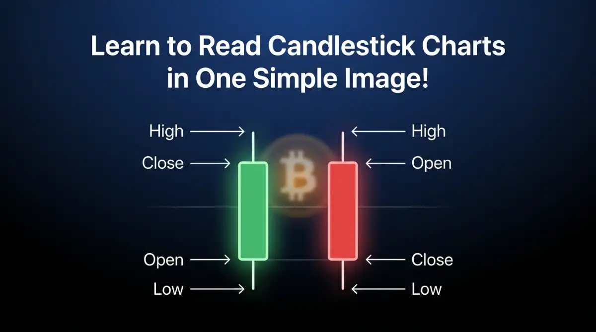
A candlestick can show all four important price points:
- Open: $100
- High: $108
- Low: $98
- Close: $105
That means one candle gives you a compact summary of the price activity during that particular period.
When hundreds of candles are placed next to one another, they create a visual history of market behavior.
The Four Numbers Every Candle Shows
Before studying patterns, you should become comfortable with the four basic pieces of information represented by a candlestick.
Open Price
The open price is the price at which the selected trading period began.
For example, if you are looking at a one-hour chart, the opening price represents where the candle’s period started.
On a daily chart, it represents the beginning of that day’s trading period.
Close Price
The close price is where the cryptocurrency finished at the end of the selected period.
The relationship between the opening and closing prices helps determine whether the candle is generally bullish or bearish.
If the price closes above the opening price, the candle is commonly displayed as green.
If it closes below the opening price, it is commonly displayed as red.
However, chart colors can be customized, so it is better to understand the underlying open-and-close relationship rather than relying exclusively on color.
High Price
The high represents the highest price reached during the candle’s period.
It can be noticeably higher than the opening or closing price.
Low Price
The low represents the lowest price reached during the candle’s period.
Together, the open, high, low, and close create the basic structure of every standard candlestick.
Understanding the Candle Body
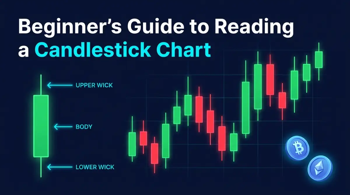
The thick central portion of a candlestick is called the body.
The body represents the distance between the opening price and closing price.
Consider a simplified example:
If a cryptocurrency opens at $100 and closes at $106, the candle body represents the movement between $100 and $106.
If it opens at $106 and closes at $100, the body represents the movement in the opposite direction.
The size of the body can also provide useful context.
A relatively large body indicates that there was a substantial difference between the opening and closing prices during that period.
A very small body means the opening and closing prices were relatively close together.
Importantly, a large candle does not automatically mean that the price will continue moving in the same direction. Candles should be interpreted in the context of surrounding price action.
What Are the Wicks or Shadows?
The thin lines extending above or below the candle body are called wicks, tails, or shadows.
The upper wick shows how far the price moved above the body during the selected period.
The lower wick shows how far the price moved below the body.
For example, suppose a cryptocurrency:
- Opens at $100
- Reaches $110
- Falls to $96
- Closes at $104
The candle would have a body between $100 and $104.
The upper wick would extend toward $110.
The lower wick would extend toward $96.
This is useful because the closing price alone would not tell you that the market had temporarily reached both significantly higher and lower levels.
Green and Red Candles Explained
Most cryptocurrency charting platforms use contrasting colors to make bullish and bearish candles easy to identify.
Green Candle
A typical green candle means:
Close > Open
In simple terms, the cryptocurrency finished the period at a higher price than where it started.
For example:
Open = $100
Close = $105
This produces a bullish or upward candle under the standard color convention.
Red Candle
A typical red candle means:
Close < Open
For example:
Open = $105
Close = $100
The cryptocurrency finished the period lower than where it started.
Remember that the color itself is not the important part. The relationship between the opening and closing prices is what matters.
The Timeframe Changes What a Candle Means
One of the most common beginner mistakes is forgetting that every candlestick represents a specific timeframe.
A candle on a 1-minute chart represents one minute of price activity.
A candle on a 15-minute chart represents fifteen minutes.
A candle on a 1-hour chart represents one hour.
A candle on a 4-hour chart represents four hours.
A candle on a daily chart represents a day.
This means the same cryptocurrency can display very different candle structures depending on the selected timeframe.
For example, a strong bullish candle on a short-term chart does not necessarily mean that the broader market trend is bullish.
This is why experienced chart readers often examine more than one timeframe instead of interpreting a single candle in isolation.
How to Read a Single Candlestick
When looking at an individual candle, ask a few basic questions.
1. Where Did the Candle Open?
Identify the opening price.
2. Where Did It Close?
Compare the closing price with the opening price.
3. How Large Is the Body?
A large body and a small body communicate different information about the price movement during that period.
4. How Long Are the Wicks?
Long wicks can show that the price traveled considerably away from the opening and closing area before the period ended.
5. Where Does the Candle Appear?
This is extremely important.
The same candle can have different significance depending on whether it appears:
- In the middle of a sideways market
- Near a previous high
- Near a previous low
- During a strong upward trend
- During a strong downward trend
- Around an important support or resistance area
A candle should therefore be treated as part of a larger picture rather than as an isolated signal.
Common Candlestick Shapes Beginners Should Recognize
You do not need to memorize dozens of patterns immediately. Start with a few basic candle structures.
Doji
A doji generally has a very small body because the opening and closing prices are close to one another.
It can indicate that neither buyers nor sellers clearly dominated the period.
However, a doji does not automatically mean that a reversal is coming.
Its significance depends heavily on where it appears and what the surrounding candles are doing.
Hammer-Like Candle
A hammer-like structure usually has a relatively small body and a longer lower wick.
It can appear after a decline and may indicate that lower prices were rejected during that period.
But seeing a hammer-shaped candle alone is not enough to establish that a trend has definitely reversed.
Confirmation from subsequent price action can provide additional context.
Shooting-Star-Like Structure
A shooting-star-like candle typically features a small body with a relatively long upper wick.
It can appear after an upward move and may indicate that higher prices were rejected during that period.
Again, context matters.
A single candle cannot reliably predict what the market will do next.
Why Long Wicks Can Be Important
Long wicks often attract attention because they show that price traveled significantly away from the candle’s body.
Consider a candle with a long upper wick.
The price moved substantially higher during the period but eventually came back down before the candle closed.
That tells you something important about what happened during that timeframe: higher prices were reached, but the market did not maintain those levels into the close.
Similarly, a long lower wick shows that price moved substantially lower before recovering toward the closing area.
However, a wick should not automatically be interpreted as proof that buyers or sellers will dominate the next candle.
It is better viewed as evidence of price behavior that requires context.
Reading Multiple Candles Together
Once you understand individual candles, the next step is learning to read them as a sequence.
Imagine you see:
Red → Red → Red → Small-bodied candle → Green → Green
Rather than looking at each candle independently, you can ask:
- Was the market previously declining?
- Did selling pressure appear to slow?
- Did buyers subsequently push price higher?
- Did the move occur near an important price level?
- Was trading activity unusually strong or weak?
This approach is much more useful than memorizing a long list of pattern names.
Candlestick analysis is fundamentally about understanding price behavior over time.
Identifying the Basic Market Trend
Before interpreting individual patterns, identify the broader direction of the market.
There are three basic conditions beginners should recognize.
Uptrend
An uptrend generally contains a sequence of progressively higher highs and higher lows.
For example:
Low → Higher Low → Higher High → Higher Low → Higher High
This suggests that price has generally been moving upward.
Downtrend
A downtrend generally features lower highs and lower lows.
For example:
High → Lower High → Lower Low → Lower High → Lower Low
This indicates broader downward movement.
Sideways Market
A sideways or range-bound market occurs when price moves within a relatively defined area without establishing a clear upward or downward direction.
In this environment, individual candles can become particularly misleading if interpreted without considering the broader range.
Support and Resistance Add Context
Candlesticks become more informative when you understand basic support and resistance.
Support
Support is a price area where buying interest has historically appeared strongly enough to slow or temporarily stop a decline.
It should not be considered an unbreakable floor.
Price can move below support.
Resistance
Resistance is a price area where selling pressure has historically appeared strongly enough to slow or temporarily stop an advance.
It is not an absolute ceiling.
Price can move above resistance.
When a candlestick pattern appears near one of these areas, it can provide more context than the same pattern appearing randomly in the middle of a chart.
Volume Can Provide Additional Context
Candlesticks primarily describe price movement, while volume can provide information about trading activity.
For example, a significant price move accompanied by unusually high volume may deserve more attention than a similar-looking move occurring with very low volume.
Volume does not guarantee that a move will continue.
Instead, it provides another piece of information that can be considered alongside:
- Price structure
- Candlestick shape
- Market trend
- Support and resistance
- Timeframe
- Broader market conditions
Using several pieces of evidence is generally more informative than depending on one indicator or one candle.
A Simple Method for Reading Any Crypto Chart
When you open a cryptocurrency candlestick chart, avoid immediately searching for a pattern to trade.
Instead, work through the chart in an organized order:
First: Identify the timeframe.
Second: Determine whether the broader price movement is upward, downward, or sideways.
Third: Mark obvious areas where price has previously reacted.
Fourth: Examine recent candles and compare their bodies and wicks.
Fifth: Look for changes in momentum or price structure.
Sixth: Consider volume and other relevant market information.
Finally: Ask whether the evidence actually supports your interpretation or whether you may simply be seeing what you expect to see.
This process helps reduce the confusion that often comes from staring at a chart filled with indicators and pattern names.
Mistakes Beginners Often Make With Candlestick Charts
Mistake 1: Treating Every Pattern as a Signal
Not every recognizable candle means “buy” or “sell.”
Patterns are probabilities and observations, not guarantees.
Mistake 2: Ignoring the Timeframe
A candle that looks significant on a five-minute chart may have little importance on a much larger timeframe.
Mistake 3: Using Too Many Indicators
Adding numerous indicators can make a chart more confusing rather than more informative.
Start with price, candles, trend, support, resistance, and volume before experimenting with more advanced tools.
Mistake 4: Believing One Candle Predicts the Future
Candlesticks describe what has happened during a specific period. They do not provide certainty about what will happen next.
Mistake 5: Ignoring Risk
Even an apparently strong chart setup can fail.
Cryptocurrency markets can experience rapid price movements, and losses can occur unexpectedly. Learning to read charts should therefore go hand in hand with learning about risk management.
Building Confidence Without Rushing Into Trades
The best way to become comfortable with candlestick charts is through observation and practice.
Open historical charts and choose different timeframes. Pick random candles and identify:
- Open
- Close
- High
- Low
- Body size
- Upper wick
- Lower wick
- Overall trend
- Nearby support or resistance
Then move forward through the chart and observe what happened afterward.
This exercise helps separate chart-reading skills from emotional decision-making.
You can also keep a simple learning journal. Record what you thought a particular candle or market structure suggested and later compare that interpretation with what actually happened.
The goal is not to prove that every prediction was correct.
The goal is to understand why a particular interpretation worked or failed.
Where to Go From Here
Learning candlestick charts is one of the foundational skills for anyone interested in cryptocurrency market analysis.
You do not need to memorize every candlestick pattern before you can understand a chart. Start with the fundamentals: open, high, low, close, body, wick, timeframe, trend, support, resistance, and volume.
Once these concepts become familiar, more advanced subjects such as multi-candle patterns, market structure, momentum, and technical indicators become considerably easier to understand.
Most importantly, treat candlestick analysis as a tool for interpreting market information—not as a crystal ball.
A well-read chart can help you understand what price has been doing. It cannot remove uncertainty from the cryptocurrency market.
Look Beyond Individual Candles
One of the best habits you can build early on is stopping the idea that every candle is its own separate story.
For example, if you see a bunch of big green candles, it might look like strong upward momentum at first.
But what if those candles show up right after a long drop?
That context changes everything.
Same thing with wicks — a long upper wick can mean different things depending on where it appears.
Instead of asking:
“What does this candle mean?”
Try asking:
“What does this candle mean compared to everything around it?”
That small shift makes a huge difference in how you read charts.
How Candle Sequences Reveal Changing Momentum
Momentum is basically how strong and steady a price move is.
You can usually spot changes in momentum by looking at a series of candles instead of just one.
When Bullish Momentum Is Strengthening
Picture a market where green candles keep getting bigger and closing higher.
You might notice things like:
- Higher closing prices
- Bigger green bodies
- Fewer lower wicks
- Price breaking recent highs
This usually suggests buyers are in control.
But even strong momentum doesn’t last forever.
Markets can flip quickly, especially after big moves.
When Bullish Momentum Starts Slowing Down
Now imagine a few green candles, but each one is smaller than the last.
Price might still be going up, but it’s not as strong anymore.
You might also see longer upper wicks.
This can mean momentum is fading a bit.
It doesn’t automatically mean a reversal is coming — it just means you should pay closer attention.
Comparing Candle Bodies Can Reveal More Than Color
A lot of beginners focus too much on whether candles are green or red.
A better approach is comparing how big the bodies are relative to each other.
For example:
Big green candle → medium green candle → small green candle
Price is still going up, but the strength is clearly changing.
Now flip it:
Small red candle → medium red candle → big red candle
That could suggest selling pressure is picking up.
This still isn’t a “signal” by itself — it’s just information.
The key idea is comparison.
Candles only really make sense when you look at them next to each other.
Understanding Rejection Through Price Behavior
“Rejection” is just a way of saying price tried to go somewhere but couldn’t stay there.
For example, if price shoots up during a candle but closes much lower, that often leaves a long upper wick.
That wick shows buyers pushed higher, but sellers pushed it back down before the close.
A long lower wick is the opposite — price dropped, but buyers stepped in and pushed it back up.
Why Context Matters
A long wick near a key level matters more than the same wick in the middle of nowhere.
So instead of just asking:
“Is the wick long?”
Ask things like:
- Where did it happen?
- What was price doing before this?
- Was it near a key high or low?
- What did the next candle do?
- Is the market trending or moving sideways?
These questions help you avoid oversimplifying what you’re seeing.
Using Candle Clusters Instead of Memorizing Hundreds of Patterns
There are tons of named candlestick patterns, and it’s easy to get overwhelmed trying to memorize them all.
A simpler way is to think in terms of clusters of candles.
A cluster is just a group of candles that tell a shared story.
For example:
- Small bodies
- Lots of wicks
- Tight price movement
- Frequent switching between green and red
That often means the market is unsure or just moving sideways.
Another cluster might show:
- Strong green candles
- Small upper wicks
- Higher closes
- A breakout from a range
That tells a very different story.
You don’t need fancy names to understand what’s happening.
What Consolidation Looks Like on a Chart
Consolidation is when price slows down and moves sideways after a strong move or during uncertainty.
Candles usually get smaller and start overlapping.
You might see:
- Small candle bodies
- Overlapping price action
- Frequent color changes
- Reactions around the same levels
Consolidation can lead to a big move later — but the direction is never guaranteed.
That’s why it’s risky to assume sideways always means “break up” or “break down.”
Understanding Breakouts More Carefully
A breakout happens when price moves beyond a key level or range.
For example, if price keeps failing at resistance and then finally pushes above it, that’s called a breakout.
But not all breakouts stick.
The Problem of False Breakouts
Sometimes price breaks a level briefly and then falls back inside the range.
That’s a false breakout.
Candles can help you spot this.
For example, if price moves above resistance but closes back below it with a long upper wick, that’s a warning sign the move didn’t hold.
Still, one candle alone doesn’t confirm anything — you need follow-through.
Why Candle Closes Deserve Attention
A candle can look super strong during the middle of its formation, but end up closing very differently.
That’s why the close matters a lot.
For example:
- Price spikes above resistance but closes below it → weak follow-through
- Price breaks above resistance and holds it into the close → stronger signal of acceptance
The close shows where the market actually “settled” for that time period.
Be Careful With Unfinished Candles
An active candle can change a lot before it closes.
A strong-looking green candle can shrink.
A long wick can disappear or change completely.
So when studying charts, make sure you know whether you’re looking at a finished candle or one still forming.
Multiple Timeframes Can Provide a Broader Picture
Looking at different timeframes helps you understand the bigger picture.
For example:
- Higher timeframe: overall uptrend
- Mid timeframe: short pullback
- Lower timeframe: small recovery
All of these can be happening at the same time.
That’s normal — markets move in layers.
A Practical Multi-Timeframe Approach
Keep it simple:
Start with a higher timeframe to see the main trend.
Then zoom in to see recent price action.
Finally, compare whether the short-term move matches or goes against the bigger trend.
This helps you avoid overreacting to small moves.
How Support and Resistance Can Change Roles
Sometimes a level that used to act as resistance becomes support after price breaks above it.
And support can turn into resistance after a breakdown.
This is called a role reversal.
For example:
Price struggles to break above a level for a while → eventually breaks through → later comes back and holds that same level as support.
But remember: these are zones, not exact lines.
Markets don’t respect perfect prices.
Reading Price Gaps Is Different in Crypto
In traditional markets, gaps can happen when trading closes and reopens at a different price.
Crypto doesn’t really work that way because it trades 24/7.
So don’t blindly apply stock-market rules to crypto charts.
The main idea is simple:
Always understand the market you’re looking at before applying a concept.
Different markets behave differently.
How Volume and Price Can Be Read Together
Price shows movement. Volume shows activity behind that movement.
For example:
- Price goes up quietly with low volume
- Price goes up strongly with high volume
These can mean different things.
But volume alone doesn’t predict direction.
It can spike during both up and down moves.
The best approach is to combine:
price + candle structure + volume
Recognizing Exhaustion Without Assuming a Reversal
After a strong move, you might notice signs that momentum is slowing:
- Smaller candles
- Longer wicks
- Less progress overall
- Strong candles getting weaker
- Price struggling at a level
This can mean the move is losing strength.
But here’s the key:
Slowing momentum does NOT automatically mean reversal.
Price can pause, consolidate, or continue.
Your job is to observe, not assume.
A Better Way to Think About Candlestick Patterns
Candlestick patterns are just ways of describing what price did — not predictions.
A “bullish pattern” just means buyers were active in a certain way.
A “bearish pattern” just means sellers were active in a certain way.
Neither guarantees what comes next.
So instead of thinking:
“This pattern means price will go up.”
Think:
“This shows a certain behavior — I still need more context.”
That mindset keeps you grounded.

Creating a Simple Chart-Reading Routine
A simple routine helps keep things clear.
When you open a chart, try this:
Start With Market Context
Is the market trending up, down, or sideways?
Look at Structure
Higher highs? Lower lows? Range?
Mark Key Levels
Where has price reacted before?
Study Recent Candles
Body size, wicks, closes.
Check Momentum
Is price speeding up or slowing down?
Look at Volume
Is activity increasing or fading?
Wait for Confirmation
Don’t rush based on one candle.
Keeping Your Chart Clean
More indicators don’t always help.
In fact, too many can make things confusing fast.
Start simple:
Focus on price first.
Then slowly add tools only if they actually help you understand what’s happening.
If something makes your chart harder to read, it’s probably not useful yet.
Practice Without Putting Money at Risk
One of the best ways to learn is by studying past charts.
Pick a section, hide what happens next, and analyze it like it’s live.
Ask yourself:
- What trend is this in?
- What are the candles doing?
- Where are key levels?
- What might happen next?
Then reveal the next part and compare.
This helps you learn from reality instead of guessing.
A Simple Journal Can Improve Your Analysis
Writing things down helps a lot.
For each session, note:
Market: What you looked at
Timeframe: Which chart
Observation: What you saw
Reasoning: Why you thought that
Outcome: What actually happened
Lesson: What you learned
Over time, you’ll start spotting patterns in your own thinking too.
Avoid the Trap of Prediction Addiction
Trying to predict every candle gets stressful fast.
A better approach is thinking in scenarios.
Instead of:
“Price will go up.”
Think:
“If price holds this level, one outcome is possible. If it breaks, another becomes more likely.”
This keeps you flexible and realistic.
The Most Important Skill: Staying Objective
Technical analysis isn’t just about charts — it’s about controlling your bias.
If you want price to go up, you might ignore bearish signs.
If you expect a drop, you might ignore bullish ones.
That’s confirmation bias.
So challenge yourself:
- What if I’m wrong?
- What am I ignoring?
- What does the higher timeframe show?
- Am I relying on one candle?
- Is this candle even closed yet?
This keeps your thinking balanced.
Putting Everything Together
At this point, candlestick reading should feel less like memorizing patterns and more like reading behavior.
A candle shows what happened in a short time.
A group of candles shows how that behavior is evolving.
Structure shows direction.
Levels show important zones.
Volume adds context.
Timeframes connect the bigger picture.
None of it guarantees outcomes — but together, it helps you understand what’s actually going on.
A Practical Learning Path for New Chart Readers
Don’t try to learn everything at once.
Start with basic candles.
Then learn trends.
Then support and resistance.
Then momentum and candle sequences.
Then patterns and tools.
And always keep practicing on real charts.
The goal isn’t to memorize everything.
It’s to understand:
what happened, where it happened, why it matters, and what you still don’t know.
That’s real chart reading.
A Clear Framework to Remember
When a chart feels confusing, just ask:
What happened to price?
Where did it happen?
What’s the bigger trend?
What evidence supports this idea?
What’s still unclear?
Keep it simple. Keep it grounded.
Risk Disclaimer: Cryptocurrency trading involves substantial risk, and prices can move rapidly in either direction. Candlestick patterns, technical analysis, historical price behavior, and other chart-based methods cannot guarantee profits or prevent losses. This article is provided for general educational and informational purposes only and should not be considered financial, investment, legal, or tax advice. Always conduct independent research and consider your financial circumstances and risk tolerance before making any investment or trading decision.